This project has come to an end.
Goodbye.
Elleah
Friday, 6 May 2016
Monday, 11 April 2016


Friday, 8 April 2016
Evaluation 4
Evaluation 4 from Elleah Stanton on Vimeo.
How did you use media technology in the construction and research and planing and evaluation?
Created using CyberLink Webcam and Windows movie maker. It is an informal discussion with my self about how and when I used each piece of media technology, and then how well it performed.
Wednesday, 6 April 2016
Evaluation 3
What have you learned from your audience feedback?
Throughout this project, I have received audience feedback after most rough cuts of my music video and my ancillary products. I have received this feedback in many different forms including via social media, spoken feedback, surveys and focus groups.
 -The second piece of audience feedback was when I was deciding whether to use water colour or felt tip for the props I was making for my music video. I produced some test pictures, then sent them to 6 people within my target audience using Facebook Messenger. Everyone of the 17-18 year old teenagers said that the water colour is the most effective medium, so I learned that I needed to produce all of the backgrounds for the transitions between the bedroom and the different locations using water colour paint and pencils in order for my audience to be visually pleased by my music video.
This feedback was valuable to me as it meant I had the confidence knowing my decision was backed up by my target audience's preferences.
-After uploading my rough cut 2 I received audience feedback via Facebook from four people within my target audience. I learned from this that I needed to improve the contrast, use as much of the Ben/mannequin concept as much as possible and play around with the transitioning between shots. I then changed the contrast for rough cut 3, meaning the shots looked a lot brighter and bolder, especially with all the different colours of the art equipment. I learned that my target audience are more attracted to media that looks visually fun and happy. I also attempted some different transitions between shots instead of a straight cut, but these looked unprofessional so I did not use them.


.tightened up the editing on some of the shots
I learned here that I needed to increase the flow speed of my video in order to keep my audience engaged. In rough cut 4 I did this by speeding and tightening up the editing at the end of the song to lead to a big finale.

 -Audience feedback for my final cut was received via Facebook, again. Facebook proved to be quite the prefect way of gathering feedback from my specific target audience as most of the people I am friends with are around 16-20 years old. After uploading the final cut and asking for some feedback on it, it received 44 likes, 1 share and 8 comments.One thing that it was noted I could improve on was the length of the fade out at the ending. From this I learned that I needed to make the ending of the video last longer so that the impact of the couple finally being shown together is full received. I also learned that my music video has been rightly tailored towards my target audience, as proven by the amount of praise and likes it received.


Audience Focus Group from Elleah Stanton on Vimeo.
Throughout this project, I have received audience feedback after most rough cuts of my music video and my ancillary products. I have received this feedback in many different forms including via social media, spoken feedback, surveys and focus groups.
Music Video
-The first piece of audience feedback I received was feedback from a spoken questionnaire where I asked my target audience what kind of narrative they enjoy watching in TV, film and music video. I did this during the initial planning stages of my project to see what plot would suit my audience best. I learned from this that 16-20 year old people prefer a love story narrative the most. So I then decided that I would base my music video idea around a love story. -The second piece of audience feedback was when I was deciding whether to use water colour or felt tip for the props I was making for my music video. I produced some test pictures, then sent them to 6 people within my target audience using Facebook Messenger. Everyone of the 17-18 year old teenagers said that the water colour is the most effective medium, so I learned that I needed to produce all of the backgrounds for the transitions between the bedroom and the different locations using water colour paint and pencils in order for my audience to be visually pleased by my music video.
This feedback was valuable to me as it meant I had the confidence knowing my decision was backed up by my target audience's preferences.
-After uploading my rough cut 2 I received audience feedback via Facebook from four people within my target audience. I learned from this that I needed to improve the contrast, use as much of the Ben/mannequin concept as much as possible and play around with the transitioning between shots. I then changed the contrast for rough cut 3, meaning the shots looked a lot brighter and bolder, especially with all the different colours of the art equipment. I learned that my target audience are more attracted to media that looks visually fun and happy. I also attempted some different transitions between shots instead of a straight cut, but these looked unprofessional so I did not use them.


-After my third rough cut, I received some verbal audience feedback. It was suggested to be that I
.sped up more towards the end of the song by cutting up some of the shots and adding more in
.added in performance footage (but we concluded that it would be difficult to include as I don't know which clips I would take out to put performance in).tightened up the editing on some of the shots
I learned here that I needed to increase the flow speed of my video in order to keep my audience engaged. In rough cut 4 I did this by speeding and tightening up the editing at the end of the song to lead to a big finale.

 -Audience feedback for my final cut was received via Facebook, again. Facebook proved to be quite the prefect way of gathering feedback from my specific target audience as most of the people I am friends with are around 16-20 years old. After uploading the final cut and asking for some feedback on it, it received 44 likes, 1 share and 8 comments.One thing that it was noted I could improve on was the length of the fade out at the ending. From this I learned that I needed to make the ending of the video last longer so that the impact of the couple finally being shown together is full received. I also learned that my music video has been rightly tailored towards my target audience, as proven by the amount of praise and likes it received.
Ancillary Products

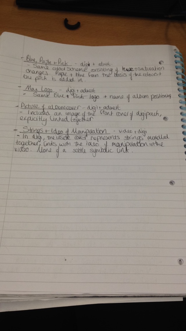
-The first feedback I received as part of the research for my branding was in the form of a survey. I collected statistics on which colour scheme they preferred. I asked 47 students in my sixth form to put a tally on one of the four test album adverts which they found the most appealing. This feedback was useful as it was easy to see a majority vote and learn what my audience wanted. I learned that they preferred the blue colour scheme to the green, pink and orange ones. This then formed the basis of the branding for my artist as it lead to a colour scheme lead by blue, with purple and pink supplementary tones.
-Then after working through the designs for my final digipack and album advert, I needed to make a decision between two logos for MAX. I did this by holding a focus group consisting of my target audience to see which logo they thought was the most appealing and effective. I learned that my audience preferred a more wacky and fun logo with a warped font to a straight bold font. Using a focus group was a really effective way of receiving feedback for me as I was able to converse with my audience and get a proper understanding of their thoughts. After receiving the information, I was able to almost finalise my digipack and album advert as I could insert the logo into both.
- Then I conducted another focus group in order to decided on the CD tray and inside cover design. It was a decision between a hand drawn heart that linked directly to the prop used in my music video where the girl draws a heart then puts the two dolls in front of it, or a piece I made in Photoshop consisting of squiggles symbolising strings. I found that my audience preferred the squiggles to the heart, showing that my target audience like more fun looking things to a more plain image.

- The final bit of audience feedback that I received as part of my ancillary products production was whether I should include reviews from different magazines on the album advert. I produced two testers, one with reviews from MOJO and NME and one without. I asked another focus group to vote which they felt looked better and was most appealing. They decided on the one with reviews. I learned from this that my target audience like to know what the opinions of magazines are before the invest into an artist or album.
I also conducted a final bit of audience research/feedback through another focus group. I filmed three members of my target audience watching my final video to see their reactions whilst watching it and showed them all my ancillary products. I then filmed them answering three questions about the products. These were:
- Do you think the relationship between the video and ancillary products is evident? why?
- Would you invest yourself into this artist and why?
- What would you add or take away from either the video or the ancillary products to improve it?
Here is the footage:
Audience Focus Group from Elleah Stanton on Vimeo.
Monday, 4 April 2016
Evaluation 2
How effective is the combination of your main and ancillary texts?
I created this evaluation using a simple power point. It is a run through of each of the reoccurring themes and conventions throughout my music video, digipack and album advert that make an effective combination.
Sunday, 20 March 2016
Evaluation 1
Evaluation 1 from Elleah Stanton on Vimeo.
How did you use, develop, or challenge codes and conventions of real media products?
I created this evaluation using a voice recorder and windows movie maker. It is an audio clip with accompanying visuals.
Thursday, 17 March 2016
Looking at Evaluation Q4
These are my written plans for the fourth and final evaluation question.
I have outlined each of the media technologies I have used throughout the project and then written notes about how I used them, how well they worked and any disadvantages I encountered.
I will present this via a video discussion with myself.


I have outlined each of the media technologies I have used throughout the project and then written notes about how I used them, how well they worked and any disadvantages I encountered.
I will present this via a video discussion with myself.


Monday, 14 March 2016
Looking at Evaluation Q3
I have produced some plans for the third evaluation question, looking at what I have learned from audience feedback throughout my project.
I made a plan looking at all the blog posts about audience feedback and what I learned from each of them. I am going to present this in written form using screenshots from all my rough cuts to show development after feedback. I will also use pictures of my ancillary products and talk about how they developed after audience feedback.


Saturday, 12 March 2016
Looking at Evaluation Q2
This is my plan for the second evaluation question looking at the effectiveness of my video and ancillary products.
I have written down all the links between the three products.I will be presenting it in a power point or mind map.

Thursday, 10 March 2016
Looking at Evaluation Q1
I have written out a plan for my first evaluation question.
The format that I will be using for this question is a video where I talk over the top of my final piece explaining to the you where I used conventions of real media texts and where I challenged them.
I will be recording the voice over soon and will put the video together at school using Premier Pro.


Tuesday, 8 March 2016
Complete Final Piece
MAX - Shot of Pure Gold Final Piece from Elleah Stanton on Vimeo. Music Video
 |
| Ancillary Product No.1 - Digipack |
 |
| Ancillary Product No.2 - Magazine Album Advert |
Thursday, 3 March 2016
Video Updated
Taking the constructive feedback from my audience, I have completed my final cut!
I increased the length of the final shot by changing the speed of the clip after the two characters land in that location. This effect also helps the ending look emotional and it nicely brings the video to a close.
FINAL VIDEO!!!!:
MAX - Shot of Pure Gold from Elleah Stanton on Vimeo.
I increased the length of the final shot by changing the speed of the clip after the two characters land in that location. This effect also helps the ending look emotional and it nicely brings the video to a close.
FINAL VIDEO!!!!:
MAX - Shot of Pure Gold from Elleah Stanton on Vimeo.
Wednesday, 2 March 2016
Audience Feedback for Final Cut
I posted my current final cut to Facebook asking people on my friends list to watch it and give me some feedback.
The response was quite amazing as it got 44 likes, 1 share and 8 comments. Here are some of the comments below:


The others included,
"There are no faults with this!"
" Brill. I was captivated"
"This is amazing I was mesmerised"
Then talking to more of my target audience the day after I posted it I received wholly feedback from a number of people expressing how they loved it.
One thing that it was noted I could improve on is the length of the fade out at the ending. I need to make the fade longer so the impact of the two together is properly received by the audience.
Monday, 29 February 2016
Thinking About Evaluation
- In what ways does your media product use, develop or challenge forms and conventions of real media products?
- How effective is the combination of your main product and ancillary texts?
- What have you learned from your audience feedback?
- How did you use media technologies in the construction and research, planning and evaluation stages?
These are the questions that I need to start thinking about and then ultimately starting to answer using a range of different methods or technologies.
Q1: Conventions of real media products
I need to look at: my research into existing music videos influenced my own planning of my music video, how my research into print products and branding conventions influenced my digipack and album advert, how and why I decided to do these things, why I decided to challenge some forms and conventions and why I chose to use and develop some.
Q2: Branding
I need to look at: my research into branding and how I used this information to create my own brand, the parallels between my video and print products and why I made them.
Q3: Audience Feedback
I need to look at: how audience feedback influenced my decisions within my video and print products, how effectively I have kept in line with appealing to my target audience .
Q4: Media Technologies
I need to look at: which technologies I used in research then planning and then for evaluation such as camera, blogger, Premeier Pro, Photoshop, Vimeo etc, how effective they each were for showing/creating my work.
Saturday, 27 February 2016
Reviews??
I have made three trials, one without any reviews, and two with reviews in different places.
I asked my target audience which they prefer and which they think looked best.
The results confirmed that the second trial with reviews looks the best, so I will be using it for my final piece.
 |
| 1 |
 |
| 2 |
 |
| 3 |
Friday, 26 February 2016
Final Digipack
This the complete version of my digipack.
I used a different template to my initial one due to the fact that this one had all the measurments, room for the spine and the correct number of pages.
I have included a spine which consists of the name of the artist, the name of the album and the product number in the same font as the copyright info on the back cover.
I am very happy with my final product.

Thursday, 25 February 2016
Audience Feedback for Final Digipack
These are my two final designs for the covers of my digipack. I am not sure which one I prefer so I collected target audience feedback via social media.
I have asked a focus group online consisting of 17-20 year olds which they find most effective.
The Results:
No.1 - 6
No.2 - 2
The clear vote for the final digipack is no.1 so based on this I will be using that design for my final digipack.
The Results:
No.1 - 6
No.2 - 2
The clear vote for the final digipack is no.1 so based on this I will be using that design for my final digipack.
 |
| 1 |
 |
| 2 |
Tuesday, 23 February 2016
Final Cut Three
Here is the edited video with the ending edited on.
Final Cut 3 - With Ending from Elleah Stanton on Vimeo.
I will be editing the video more to speed up the final shots.
Final Cut 3 - With Ending from Elleah Stanton on Vimeo.
I will be editing the video more to speed up the final shots.
Monday, 22 February 2016
Shot List From Final Day of Shooting

There are the shots from the final day of shooting. I have looked through them all and most of them aren't exactly what I want because they dont act for long enough. However there is one shot, MVI_1435, which is perfect because the two characters are laughing along with eachother, which will look effective with a dip to black videa transition, It will leave the video on a optimistic, light hearted note where the audience will assume that the two characters carry on their romantic relationship together.
Wednesday, 17 February 2016
Left Inside and CD Tray Design
After receiving teacher feedback, I created a new inside design so see if it compares to my standing design.
It was suggested that I use the heart from the ending of my music video. I have taken a photo of it, made it a square and edited it slightly. I wont be able to properly see whether this design will look better or not until I can edit it using Photoshop at school next week.


It was suggested that I use the heart from the ending of my music video. I have taken a photo of it, made it a square and edited it slightly. I wont be able to properly see whether this design will look better or not until I can edit it using Photoshop at school next week.


Monday, 15 February 2016
FINAL Filming Update
The final shot has finally been filmed! (Hoorah)


We managed to get Ben and Rachel available at the same time to film. It took about ten minutes to do after clearing my landing and adding lighting so that it was brightly lit.
I decided to do it here because it is a plain background much like the background of the heart design, which allows the two characters to seem alone together in their own world.

The only problem I faced was getting the camera straight, or seem straight, due to our wonky house.
I have many shots to choose from and I will get straight onto editing them in as soon as half term holidays are over!

Friday, 12 February 2016
Changes to Digipack
After receiving feedback on my digipack from my teacher I will :
- Trialing a different left inside cover using the image of the heart from the booklet images
- Add in a reference number to the back cover
- Create a spine
- Trialing a different left inside cover using the image of the heart from the booklet images
- Add in a reference number to the back cover
- Create a spine
Thursday, 11 February 2016
Final Digipack as of 11/02/16
Final Digipack as of 11/02/16 from elleahmedia
I may make small changes to the pieces and I will be sure to update them on my blog when I come to it.
I may make small changes to the pieces and I will be sure to update them on my blog when I come to it.
Wednesday, 10 February 2016


Final Digipack
This is my final design as of today for my digipack.
It my change after teacher feedback.
It my change after teacher feedback.
| Front Cover |
| Back Cover |
 |
| CD Tray and Left Inside |
 |
| CD Design |
Tuesday, 9 February 2016
Final Magazine Album Advert Process + Focus Group
I have completed my final magazine advert after making some changed to my last draft.
After doing some finishing touches on my magazine and adding in 'CD/DOWNLOAD' and an image of the album cover, I realised that the logo on the advert was quite different to the one on my CD cover. So, to see which looked better I created a CD cover with the more whacky MAX logo to compare the two and get target audience feedback.
I organised a focus group consisting of members of my target audience and I asked them which design of the logo they preferred. The general consensus was that the new design where the logo is distorted looked better and more appealing than the original.
I decided against the different coloured posters as I want to keep the same colours through all my print products. I also decided against the string look for the pixels, purely because I think the larger pixels look more professional and subtle.
Here is my final magazine advert:

Sunday, 7 February 2016
Thursday, 4 February 2016
Branding With Pixels
Using the pixilate tool, I have added them in to the rest of the components of my digipack in order to keep brand identity.
I really like this design because I think it adds another dimension to it, and it looks a lot more professional and individual.
I have also added on a bar code as a finishing touch.


I really like this design because I think it adds another dimension to it, and it looks a lot more professional and individual.
I have also added on a bar code as a finishing touch.

Subscribe to:
Comments (Atom)