View my prezi here:
http://prezi.com/w-3tsrro4ken/?utm_campaign=share&utm_medium=copy
Tuesday, 29 December 2015
Sunday, 27 December 2015
MAX LOGO
My artists current logo(s):


These were found on his website, single cover and online store. They all carry the same brand identity of:
. simple lettering and font through use of only straight lines and wide width.
. dark colours (black or grey) with one colour standing out (red)
. one letter (A) with a certain edge to it, the letter A has no middle line
.capitals
For my own logo, there are some things I want to take from his existing logo:
. simple lettering and straight lines, I am using a bold, thick font on Photoshop to
. one letter that is different to the other letters, I am changing the colour of the A
.capitals, I want the name MAX to stand out against any other artists name
However I am going to completely revert his brand identity here that seems to be quite dark, and introduce bright colours, greens and blues. I do not want the background to be dark, I am going to have it colourful with lot of changes in colour, so that when the logo is placed on top, the bold thickness of it will make it stand out. I am doing this so that my branding matches the uplifting tones of my music video and so that it attracts a young audience.
Here are some examples of which font I will use that I created on word:
 POPLAR STD


 :
:


These were found on his website, single cover and online store. They all carry the same brand identity of:
. simple lettering and font through use of only straight lines and wide width.
. dark colours (black or grey) with one colour standing out (red)
. one letter (A) with a certain edge to it, the letter A has no middle line
.capitals
For my own logo, there are some things I want to take from his existing logo:
. simple lettering and straight lines, I am using a bold, thick font on Photoshop to
. one letter that is different to the other letters, I am changing the colour of the A
.capitals, I want the name MAX to stand out against any other artists name
However I am going to completely revert his brand identity here that seems to be quite dark, and introduce bright colours, greens and blues. I do not want the background to be dark, I am going to have it colourful with lot of changes in colour, so that when the logo is placed on top, the bold thickness of it will make it stand out. I am doing this so that my branding matches the uplifting tones of my music video and so that it attracts a young audience.
Here are some examples of which font I will use that I created on word:
POPLAR STDFriday, 25 December 2015
Digipak Planning
After doing some rough trials on Photoshop using colour and real images, I decided that I needed to start basic in order to know exactly what I want my digipak to look like. I have put together a plan of where I want each other the objects to be placed on the digipak using Microsoft Paint.
This is only an incredibly brief, non-detailed plan, however it is essential for to know exactly what I need to start planning in terms of font, colour, images and design,

This is only an incredibly brief, non-detailed plan, however it is essential for to know exactly what I need to start planning in terms of font, colour, images and design,
Wednesday, 23 December 2015
Album Advert Magazine


After looking at a wide range of album adverts for magazines, I have come to a conclusion of the conventions of a album advert.
-As seen above. the name of the artist is the biggest (if not second biggest) focal point of the advert. For Olly Murs, Madonna and You Me At Six, their names are the place the consumers eyes will look first.
- Once the consumer has then established the artist, they then are drawn to the colour scheme mixed with the other images in the advert. For Olly Murs it is the repeated image of himself in the middle of the page, which has now helped the consumer understand who the artist is if they were unsure before. If they knew fully well who it was, the image of the artist may encourage them to read the advert. This would often be the case when voyeurism is used, for both males and females. The artists are dressed up in attractive and fashionable clothing to lure in the attention of the consumer.For Coldplay and YMAS it is the assortment of colours behind the text that catches the eye here.
-Then, the consumer is fully engaged with the advert and (hopefully) wants to find out the details of this advert such as the release date, the name of the album and where they can buy it from. For Olly, Coldplay and YMAS, the date of release takes up a large amount of area on the page, which can be argued to be the third most important piece of information, as this is when the consumer will be able to do what they do best, consume, and give money to the artist, which is exactly what the advert is trying to achieve.
- It is often that the colour scheme, typography or images are similar or even exactly the same to the other promotional pieces of media made by the record company to ensure a brand identity is made.E.g the YMAS image is the same as the image on the front of the album cover.
- Another part of a music advert is the mention of certain songs that will be heard in the album. This is done so that the consumer can connect their past experiences of the single they heard on the radio with the musis advert, which will encourage them further to buy the album and anticipate its release.
These conventions form the basis of what I will create on Photoshop for MAX's album: Pull My Strings, Including hit single: Shot Of Pure Gold.
Tuesday, 22 December 2015
Editing Update
So, I'm almost at the end of the song! I can only edit during lesson time as I don't have the software to at home. However, when I can edit, I am quite quick and I work effectively.
I am just in the process of putting all the shots in the right place and then I will move on to changing the colours and brightness.
After this, I will go through the video again and tighten up any bits to make sure it flows properly.
Problems I have encountered:
- I have a lot of footage that I want to include of Ben in the different places but not enough space to put them in. This meant I had to select my favourite clips and edit them in as much as I could, enough to avoid making it look like I am overloading it with footage.
- I can't find the footage from the music rooms shoot on the hard drive. This is a minor set back as it means I have to upload them off the camera again.

Monday, 21 December 2015
Section A - Research and Planning
This is my second installment for the prezi's I will be creating regarding my exam.
Watch here:
http://prezi.com/sqjozk0ixp7d/?utm_campaign=share&utm_medium=copy
Watch here:
http://prezi.com/sqjozk0ixp7d/?utm_campaign=share&utm_medium=copy
Saturday, 19 December 2015
Performance Footage?
It has been suggested to me that I film some performance footage of Ben singing to the song as just the artist in a stage like set up.
I had decided that I would not include any separate footage of the artist singing due to the fact that I feel this would make the video too disjointed and break it away from the narrative of the boy and the girl. I think it would take away from the narrative.
I have however included a type of performance footage, when Ben is sat by himself signing the lyrics to his own song, which will be edited in after the Christmas holidays.
I have chosen not to include stage performance footage for the reason that I feel it would look too disjointed.
I have filmed some performance footage to see what it would look like when put to my music:
I have decided not to use this footage in my video as I think that it will take away from the concept of the video.
I understand that this subverts a very arguably important part of genre theory, however I purposely wanted to subvert boundaries and expectations in order to present MAX as a unique, new and individual artist as this would appeal to my target audience.
performance footage.prproj from Elleah Stanton on Vimeo.
Friday, 18 December 2015
Audience Feedback
After uploading my second rough cut, I have now decided to get some audience feedback on my video so far.
I have sent messages on Facebook to six people within my target audience asking for three things they think I should add or take out of my rough cut.
"use as much of that doll placement/Ben placement concept as well as you can"
"more contrast"
"play around with transitions"
Person No.2:
" if you were to add anything it would be an effect that make the colours really pop, so that it's really vibrant "
"I don't think anything really needs taking out, I think it's great. I like the storyline and it flows well"
I have sent messages on Facebook to six people within my target audience asking for three things they think I should add or take out of my rough cut.
"Could you watch this and give me three things you think I need to add in or take out? (this is only my second rough cut, its only half finished and there are parts missing). Thankyou! https://vimeo.com/149257870"Person No.1:
"use as much of that doll placement/Ben placement concept as well as you can"
"more contrast"
"play around with transitions"
Person No.2:
" if you were to add anything it would be an effect that make the colours really pop, so that it's really vibrant "
"I don't think anything really needs taking out, I think it's great. I like the storyline and it flows well"
Person no.3:
"Erm I think if anything needs taking out its the close ups of Rachel's mouth etc. I get you're trying to make her look manipulative with that but I just feel it's space filler so maybe cut that unless you disagree"
Person no.4:
"It's a really cool concept and I'm not sure what I'd change about it, the pace was a tad too fast for me but if you're cutting to a song beat then there's not really much you can do about that"
So to conclude, the changes that I will make to my rough cut are:
-play around with the contrast and the transitioning
-replace some of the close up shots of Rachel
Thursday, 17 December 2015
Editing So Far
Rough Cut 2 from Elleah Stanton on Vimeo.
This video is what I have done so far in the editing process, it only half of the video but I will be completing the rest after the Christmas holiday.
Sorting Through New Footage
Today, I uploaded all the footage that I filmed of Ben for the starting scenes of him sat on the sofa. There is certainly a lot of footage there that I will be able to use to introduce him earlier in the video.

After watching all of them through, all but one or two will be able to be used in the video. I wont need anywhere near this much of footage but it is a good feeling to have enough footage that I can choose from so that I get the most perfect shots.
This is the last time (hopefully) that I will be filming these scenes, so now I need to start editing them into my existing rough cut on Premier Pro. I had planned to do that today however for some reason my Premier Pro is being incredibly slow and not loading any of my footage. I will have to pick back up with editing after the Christmas holidays where I will be completing lots of blog posts on the exam and branding.
I am hoping to export whatever I have edited up to now so that you can see what stage I am at in the editing process. I will be uploading it to Vimeo.
Wednesday, 16 December 2015
Section A - Creativity
I have put together a Prezi presentation looking at the first question of Section A in my exam, since it is based around my coursework from over the past two years.
I am planning on making this kind of plan for each of the other aspects the exam could ask me about including:
Research and planning
Using conventions from real media texts
Digital Technology
Post Production
I am planning on making this kind of plan for each of the other aspects the exam could ask me about including:
View it here:
Monday, 14 December 2015
Filming!
So, I filmed the starting shots of Ben again for the third time now, so hopefully they will be okay this time!

I have filmed Ben dancing to him self and singing the lyrics to the start of the song. To do this I just played the song to him a few times and after a while he started to know the words and feel familiar with the song, meaning that his dancing is natural and believable.
I think using this to introduce him earlier in the video will make it a lot clearer to the viewer the story that I am trying to put across.
Tuesday, 8 December 2015
Reshooting
After starting to edit in the clips of Ben on the sofa getting his limbs pulled up by Rachel, I realised that I need to introduce Ben a bit earlier in the montage as he comes in quite abruptly. I don't have enough footage already filmed to put in so I am going to have to reshoot. I will film Ben in the same place on the sofa but I will have him singing along to the song as if he is just singing them to himself and nobody is watching. I will have to edit this in properly so that it doesn't ruin the other editing that I've already done.
Rehearsing editing I've moved on for now to the parts where Ben is starting to get put in different locations. I have done the first and the school one so far which look pretty good, I'm very pleased with how they look.
I will be reshooting the starting shots this Saturday, ready to edit in next week.
I don't think that I am going to get the whole thing editors before the end of this term, so my editing will have to leak into the start of next year, unless I can get premier pro on my laptop at home so that I can do it over the Christmas holidays.
Sunday, 6 December 2015
Artist Name
I have seen that usually, on this course students have created a new name for their artist instead of keeping the name of the artist of the song they chose.
However, I have decided to keep the name MAX due to the fact that he is quite an unknown artist. I also decided this because I really like the simplicity of the name as it allows me to play around with it's lettering and size as if it is more of an image than a word.
However, I have decided to keep the name MAX due to the fact that he is quite an unknown artist. I also decided this because I really like the simplicity of the name as it allows me to play around with it's lettering and size as if it is more of an image than a word.
Saturday, 5 December 2015
Mannequin Photography Update
I have just played around with pixlr editor and pixlr express to edit one of my photos for an album advertisement. I wanted to make the colours quite bright and 'groovy'. In pixlr editor I took the image and got rid of the date across the bottom using a white paintbrush and smudge tool/ I then posterised it, making it look less realistic and more fantasy like.

I then took the image over to pixlr express and added some filters and changed the colours to make it look more pop arty and brightly coloured, taking inspiration from my research where I found that my target audience preferred the cooler colours to the warmer colours.


I then took the image over to pixlr express and added some filters and changed the colours to make it look more pop arty and brightly coloured, taking inspiration from my research where I found that my target audience preferred the cooler colours to the warmer colours.

Photography
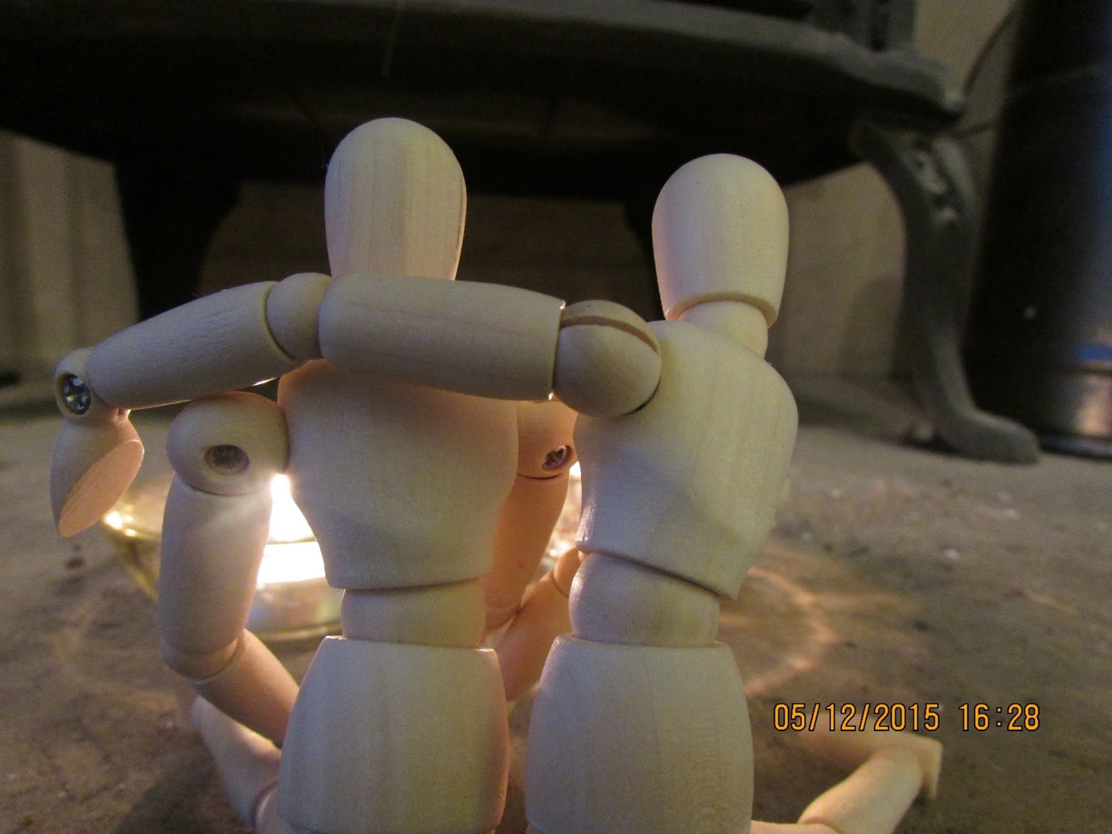
So today I have taken some photos for ideas for my digi-pak and advertisement. I put my two mannequins that I used for filming in front of two lit candles. I wanted to create a romantic scene between the two mannequins as they represent the couple in the music video.
After taking the photos I then realised that the date is printed over the top of them which is incredibly annoying. I will just take more photos another time and set up the scenario a bit more tighter and with more care.
Here are the some of the photos:


After taking the photos I then realised that the date is printed over the top of them which is incredibly annoying. I will just take more photos another time and set up the scenario a bit more tighter and with more care.
Here are the some of the photos:


Friday, 4 December 2015
Branding Update
I realise it has been a while since I have addressed the branding half of this project, however now I wanted to update you withy my feelings towards my print products and what they might look like after a bit of audience feedback and starting the editing of my final video.
After conducting some research among 46 students in my Sixth Form (who fall into my target audience of 16-20 year olds), I found that they preferred the blue and green colour scheme as opposed to the pink and red colours. When I conducted this, which was very close to the beginning of the project, I had in my head that the song I would be using would be darker (Puppeteer) than Shot of Pure Gold which I am using now. Therefore when testing my print products, I went for the slightly darker look with a black background and colourful hints in it to fit in with my research about pop branding.
 However, now after changing my song to something with a happier, more fun tone, I think I will need to change my print ideas slightly so that they too are bright and match the music video. My music video will be full of colour with lots of shots outside with bright lighting, and shots containing colourful art supplies, with not much darkness in it so in order to complete my brand, the print products need to look a lot more colourful and bright.
I will however keep in mind the fact that my audience voted more heavily for the green and blue cool colours rather than the warmer ones. I will be producing some more samples, hopefully using my own photography and a wider range of colours with no dark background. I hope to take some photos of Ben tonight, and I am considering taking some photos of my two mannequins that I used in my music video because I think they look quite interesting stood together.
I could put them in different comical positions where the girl mannequin is manipulating the male one with strings, or something along those lines. I will play around with this idea at the weekend in my spare time.
In the mean time, today I will be editing some more of my video in my frees.
Thursday, 3 December 2015
Editing Update No.1
The editing has begun!
So far I have edited the first 20 seconds (approximately) and its going pretty smoothly. I spent one hour the other day editing 7 seconds worth of footage for the part when she is piling up the backgrounds she had made. I wanted them to be put down on the beat then off the beat then back on the beat so that it was very fast pace in order to heighten the fun atmosphere . I finally managed to do it and I am really happy with how it has turned out.
I feel 100% more confident using Premier Pro this time around. In AS I was quite hesitant to use it and I was not completely sure what to do. With my 'The Art of Madness' final piece for example, the footage was not cut with regard to the music, so the cuts are not on the beat or the sounds of the piano.I feel very knowledgeable in how to use it accurately and how to get the best out of its features. For now I am only concentrating on ordering and cutting the clips to the beat. After I have completed the whole video, I will then look at how I can change the colours in the footage using the brightness and contrast tools.

Sunday, 29 November 2015
Filming Update No.6
So! Yesterday I woke up at 10 am and did not stop doing media preparation/filming until 6 pm.
The first thing that I did was finish off the remaining backgrounds that I needed to start and some that I needed to finish off or change. For example I drew out the table tennis background with the table in it, which was wrong the shot of Ben consists of him behind the table, meaning that the table needed to be a prop. I had to redo the background with only the wall and the sofa. I then drew out the two backgrounds that I needed to film Rachel making, and then just got her to paint over the water colour with water so that it looked like she was actually finishing them of herself and that it was her making them the whole time. I also had to finish off making the props out of cardboard and other materials. On the day, I decided to make the scarf prop out of red felt to give the props a bit of diversity. I also decided to do this because it meant that the scarf could be easily wrapped around the doll and look a lot like a real scarf. I used black felt tip pen to create the patterns on the scarf to match the one that Ben is wearing.
I also wanted to get Rachel to physically draw one of the props, and this meant that the prop was not exactly what i wanted it to look like. It is slightly out of proportion to the shot of Ben with the ironing board which means that I might have to re-film that shot using my own hands and take out the shot of her drawing the ironing board.
 Quite spontaneously, I decided to turn my dining room into an art studio for the shots of Rachel at the start of the video making the backgrounds and props. At first I decided that I would get out a tiny yellow table from my garage and fill that with art supplies that I could find. However after looking around my house for places to film this in, i then thought that my dining room table had not been used for any of my other footage, so it would be wise to film in there. I chose to film here because it had a lot of space around the table for me to move around and get different angled shots and reach all angles of Rachel. I also decided to film here because the blank walls allowed me to be able to turn the whole room into an art studio with a few canvases of my own artwork, and a few from around my house, along with other pieces I had done on paper. I want to create the look that Rachel is accustomed to manipulating boys, like she is some kind of manipulating artist full of style and charisma. After deciding on the room, I covered the table with newspaper to give it a more rugged creative look as opposed to the table which was glass and very straight and tidy. I then collected all of my art supplies that I could find from around the house, then emptied them all onto the table in quite a random and disorderly fashion to extenuate the idea of Rachel being creative and artistic. I stuck the artwork randomly on the window to give it yet more of a rugged look. I really like how colourful the table looks and I think the bright range of colours will give my video an extremely uplifting attitude.

As for the shots in my bedroom, I completely tidied it and hoovered, took out a few bold items that would draw too much attention to themselves like my Batman rug and poster, and put all the lamps and lights on that I could find, in order to create the best lighting possible. The purple lamp and my purple carpet created a bit of a purple/pink glow to the footage which I really like because it gives the shots a bit of a warm hearted feeling.
 As for the actual filming of the piece, we filmed everything that I had planned on my shot list, which I depended on a lot. The shot list is something that I haven't properly used before in my previous projects in AS. This was because I used my storyboards as reference to what shots I needed to film, but for this project, because my storyboard was so long, I needed to create a shot lost that I would be able to use on the day for reference to what I would need to shoot.
The camera was very good fort he handheld footage, which there was a lot of. You can't actually tell that it is handheld a lot of the time because I found that there is some kind of stabilising feature on the camera which made the shots look very professional.
As for the actual filming of the piece, we filmed everything that I had planned on my shot list, which I depended on a lot. The shot list is something that I haven't properly used before in my previous projects in AS. This was because I used my storyboards as reference to what shots I needed to film, but for this project, because my storyboard was so long, I needed to create a shot lost that I would be able to use on the day for reference to what I would need to shoot.
The camera was very good fort he handheld footage, which there was a lot of. You can't actually tell that it is handheld a lot of the time because I found that there is some kind of stabilising feature on the camera which made the shots look very professional.
The lighting meant that all the footage has really good quality, which I am very pleased about.

The first thing that I did was finish off the remaining backgrounds that I needed to start and some that I needed to finish off or change. For example I drew out the table tennis background with the table in it, which was wrong the shot of Ben consists of him behind the table, meaning that the table needed to be a prop. I had to redo the background with only the wall and the sofa. I then drew out the two backgrounds that I needed to film Rachel making, and then just got her to paint over the water colour with water so that it looked like she was actually finishing them of herself and that it was her making them the whole time. I also had to finish off making the props out of cardboard and other materials. On the day, I decided to make the scarf prop out of red felt to give the props a bit of diversity. I also decided to do this because it meant that the scarf could be easily wrapped around the doll and look a lot like a real scarf. I used black felt tip pen to create the patterns on the scarf to match the one that Ben is wearing.
I also wanted to get Rachel to physically draw one of the props, and this meant that the prop was not exactly what i wanted it to look like. It is slightly out of proportion to the shot of Ben with the ironing board which means that I might have to re-film that shot using my own hands and take out the shot of her drawing the ironing board.
Setting
 Quite spontaneously, I decided to turn my dining room into an art studio for the shots of Rachel at the start of the video making the backgrounds and props. At first I decided that I would get out a tiny yellow table from my garage and fill that with art supplies that I could find. However after looking around my house for places to film this in, i then thought that my dining room table had not been used for any of my other footage, so it would be wise to film in there. I chose to film here because it had a lot of space around the table for me to move around and get different angled shots and reach all angles of Rachel. I also decided to film here because the blank walls allowed me to be able to turn the whole room into an art studio with a few canvases of my own artwork, and a few from around my house, along with other pieces I had done on paper. I want to create the look that Rachel is accustomed to manipulating boys, like she is some kind of manipulating artist full of style and charisma. After deciding on the room, I covered the table with newspaper to give it a more rugged creative look as opposed to the table which was glass and very straight and tidy. I then collected all of my art supplies that I could find from around the house, then emptied them all onto the table in quite a random and disorderly fashion to extenuate the idea of Rachel being creative and artistic. I stuck the artwork randomly on the window to give it yet more of a rugged look. I really like how colourful the table looks and I think the bright range of colours will give my video an extremely uplifting attitude.
As for the shots in my bedroom, I completely tidied it and hoovered, took out a few bold items that would draw too much attention to themselves like my Batman rug and poster, and put all the lamps and lights on that I could find, in order to create the best lighting possible. The purple lamp and my purple carpet created a bit of a purple/pink glow to the footage which I really like because it gives the shots a bit of a warm hearted feeling.
Filming
 As for the actual filming of the piece, we filmed everything that I had planned on my shot list, which I depended on a lot. The shot list is something that I haven't properly used before in my previous projects in AS. This was because I used my storyboards as reference to what shots I needed to film, but for this project, because my storyboard was so long, I needed to create a shot lost that I would be able to use on the day for reference to what I would need to shoot.
The lighting meant that all the footage has really good quality, which I am very pleased about.

Thursday, 26 November 2015
Andrew Goodwin - Music Video Theory
I have put together a Prezi slide talking about Goodwin's music video theory and how it applies to my music video.
View it here:
http://prezi.com/-qkc3eql3qnc/?utm_campaign=share&utm_medium=copy
View it here:
http://prezi.com/-qkc3eql3qnc/?utm_campaign=share&utm_medium=copy
Tuesday, 24 November 2015
Shot List for Saturday
So, I will be filming the scenes with Rachel this Saturday in my house. We don't have much time on that day to do it but this only means we will have to be efficient and good at time keeping. I will spend the day getting the set and props ready.

 I have put stars next to the certain shots I need to pay extra attention to regarding matching them up with the shots of Ben.
I have completed a shot list after going through my storyboard and writing down all the shots including Rachel. There is a LOT to do, but I have faith!
Trialling Background material
 I have just done some quick sketches of what my backgrounds might look like. I used the first shot of Ben landing in the 'forest' scene. Using my water colour pencils and water colour pallet I create one and using felt tip pens I created the other. I did both to see which would look better, and after looking at it myself, I think that the water colour looks a lot more effective than the felt tips. I have done some further research into what my target audience feel is the better method via social media.


Everyone of the 17-18 year old teenagers that replied all said that the water colour is the most effective medium. Taking this research/data I will now begin to collect a4 card and start to paint all the backgrounds. I need to print off screenshots of each of the backgrounds so that I can get them exactly matching each other. I also need to think about which ones I need to film myself making, as I have put some of these shots in my storyboard.
Filming Update No.5
Yesterday we filmed pretty much the rest of the shots we needed for the different location scenes. A highly successful day lead to three new locations filmed, and a reshoot of the dog scene, kitchen scene, and the start scene.
Football
The first location was outside my house. For this one I had planned to find a football field or shoot in the school, however convenience meant that we filmed here. I chose to do this because I only really needed a location that was clearly outside so that it seemed appropriate that he is playing with a ball. I got him to wear a blue Brazil football top so that it stood out against the rather dull tones of the background. He was also wearing blue jeans which again stood out against the brown and cream colours. The football we used was just a basic ball that will be easy for my to replicate in 2D cardboard when making the props for these scene.Regarding the quality of the shots, the bright light from the sun and clouds meant that the quality of the image is very good with high resolution. The brightness also means that I can play around with the contrast to make the colours more harsh and fun.
We encountered no problems shooting this, and my dog also decided to join in with the shots, which was not planned, but it does look quite effective when he comes bounding in among the two balls being thrown at Ben. I hope to be able to squeeze those shots in somewhere in my video, probably towards the end.

Table Tennis
This was a completely improved location as the table tennis table had only been put up in my house recently. It provides a completely different look to the other shots, and the table gives the shots a new sort of depth as it comes off the bottom of the frame, as if it was protruding through the viewers screen. Since my target audience is 16-20 year olds, the sight of sports will hopefully be a reason for them to like it as they are youthful and more likely to be able to associate themselves to sports than an older audience, especially football and table tennis.Shooting for this also went very smoothly, I had to open the curtains as wide as I could so that as much light was let in as possible. I chose to film with the window behind the camera so that the sun would light up the colours in his costume and the environment around him. Again, this means that I will be able to enhance the contrast and the colours.
These shots will replace the theme park slot in my video.

Ironing
I decided to film in my utility room, and have Ben iron some clothes and play around with the iron. Again this was pretty much improvised on the day. I chose this to provide a complete contrast to some of the stereotypically teenage and fun things that are happening in the other locations in order to create a slightly comical effect. At first, he just appears there and starts to iron, but then I filmed some shots where he starts to get bored and decides to climb underneath the ironing board, play with the steam button on the iron and dance around. I think that teenagers will be able to relate to this idea quite well, because being a teenager normally means that you have to do chores around the house, and these shots directly appeal to the teenagers who get annoyed and fed up with the countless chores around the house. This is referred to completely comically and there is no deeper meaning to it.The quality of the shots is pretty good, again I opened the blinds as much as I could to let as much light in as possible in order for Ben to be lit up properly, along with the other objects in the room. This again means I can play with the contrast and brightness in editing stages.
The only slight problem I encountered here was fitting the tripod in the room. Since it is quite big and the room was quite compact, it was tricky finding a place for the tripod to go so that it was still a long shot. After a lot of squeezing I finally find a perfect spot.
Since Ben appears here and the ironing board is already in front of him, I will have to make sure that when I film with Rachel I put the ironing board prop down first, then put the mannequin down behind it, then cut to the live action.

Reshooting
Reshooting also went pretty much perfectly. First we redid the dog scene outside before it got dark, which was the main problem with my last shots. Since it wasn't raining, my dog was in a very playful mood and was willing to stay outside. The shots are so much better this time around because the lighting is brighter and happier. I managed to get lots of shots of Conan playing with a stick and Ben giving him cuddles and playing with him, which will be going in the ending montage of the video. This will appeal to teenagers because, like I said in my Pitch presentation, animals are used a lot in pop music videos and they are adored by many teenagers.
The first thing we did when setting up for the kitchen seven was close the blinds to the window that you could see me and the camera in in the last shots. I then moved a lamp, turned all the lights on and turned the tv on so that as much light was being produced in Ben's direction as possible. After someone's didn't know what Ben was wearing on his head, I decided to use a different chef hat with black and white checkers around the rim so that t was clearly a chefs hat. Other than this, the shots were pretty much the same, just without any camera reflection in the window.
Then finally, we reshot the starting montage but filmed on a sofa instead of my brothers room. His room had really bad lightning so for this very reason, I decided that shooting on the sofa with a lot of lighting would be a lot better. We did pretty much the same thing with Ben lifting each of his limbs up as if they're being pulled up from above. I also tried to do a bit of a pan when Ben stands up so bring another dimension to these shots. I will see what this looks like when I come to editing.
Subscribe to:
Posts (Atom)